
What does it mean to be rich and how much money do you need to get there?
Sometime around 2021 I found myself inspired by conversations and observations around financial literacy and the concept of money. This rather quickly resulted in me forming a hypothesis that the vast majority of people’s definition and understanding of what it is means to be ‘rich’ doesn’t even come close to what real wealth really is. Upon reflection this inspiration had probably been lingering in the back of my mind since 2015 and the impact Bernie Sander’s had on me (and my political awakening) during his run for the Presidency.
Exploration into this topic gave me the feeling that human’s just cannot naturally visualise or fully understand the difference in scale between $1,000, $1,000,000, $1,000,000,000 and $1,000,000,000,000. And, whilst you may look at this and think to yourself “Um, Forrest, I can very clearly see the numbers increasing, are you stupid or something?”. Well, yes you’d be right that reading it is quite clear, but perspectively the difference between a million dollars and a billion dollars, for example, is still approximately… a billion dollars.

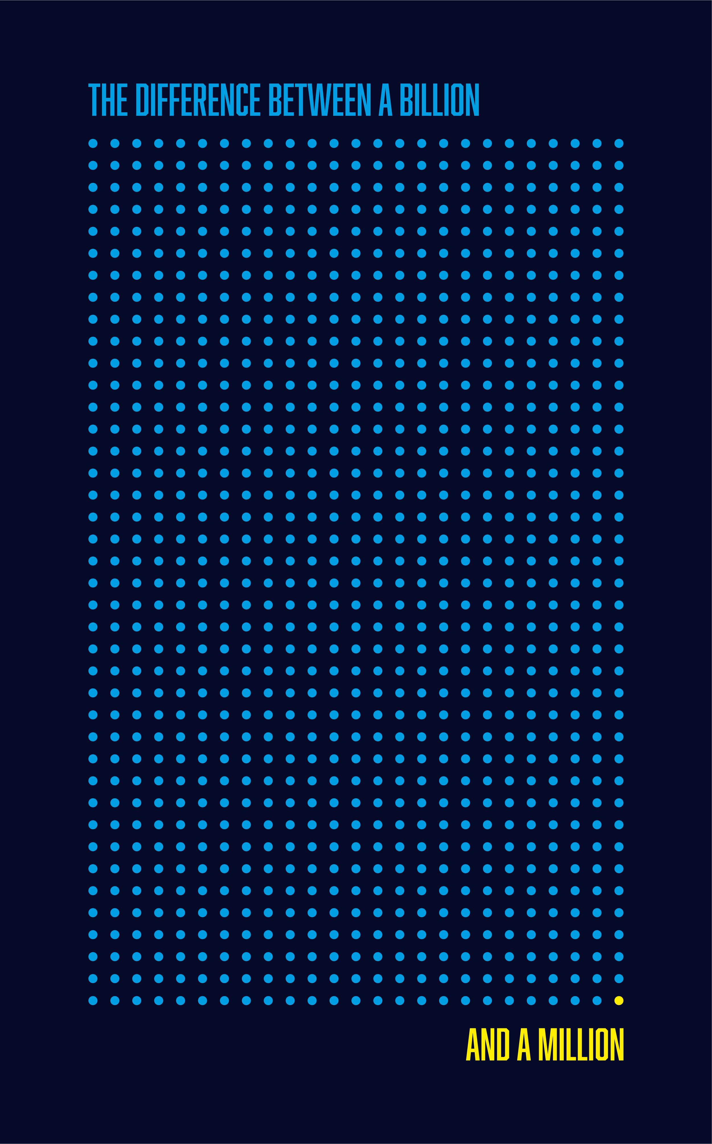
The yellow dot in the bottom right of this graphic represents one unit - let’s imagine this unit is $1 million - all the other blue dots add up to $999 million, or approximately $1 billion.
Around the time I was thinking about all this, the antiwork movement in the USA was starting to get its legs and the discussion of wealth gaps, stagnating wages, affordability, wealth inequality, ‘eat the rich’ and late stage capitalism was becoming a larger part of the discord. My general feeling observing this movement was that folks would conflate real wealth incorrectly; assuming that those who have maybe a million dollars or two (maybe a touch more even) in net worth should be the targets of what could still end up at some point becoming a modern day French Revolution.
I don’t want to get into the discussion of how we got here - Be it Reagan and the concept of trickle down economics (which frankly is fucking stupid); lazy millennials who don’t want to work; big avocado, coffee and Netflix draining bank accounts and stopping entire generations from buying property; or perhaps its just the immigrants who are stealing your jobs (no it isn’t) - I want to focus on illustrating how pretty much everyone who isn’t in the top 0.1% of wealth is pretty much ‘poor’, especially when viewed through the lens of the top 0.1%.
There have been several ways that wealth and money has been shown comparatively before. One of my favourites and a huge inspiration for this project was an interactive website called ‘1 pixel wealth’ by Matt Korostoff which is absolutely brilliant; so please please do take the time to check it out (but only after you’ve finished reading this).
Despite this, I hadn’t seen any graphic designs that showed the same kind of concept, that could be artistically printed, hung and viewed all at the same time so that one could get the full picture and context all at once. And so, what started as a series of four abstract posters grew to become an infographic aimed to help communicate the truly incomprehensible spending power of $1 trillion (as viewed through the lens of data from late 2021).
The truly incomprehensible spending power of $1 trillion - infographic posters.
Below are the four infographic posters that I created, using as up to date data as I could find at the time in 2021. The sources are at the bottom of each poster and at the end of this blog post.
Each poster has 1000 dots, with the bottom right hand corner of each poster always representing the start of the scale as the lowest nominal value represented. Each row has 25 dots on it and there are a total of 40 rows on each poster (totalling 1000 dots).
As we jump from poster to poster, each dot represents the entirety of the poster before it, acting kind of like Russian Matryoshka Dolls. Further emphasising the purchasing power and scale of wealth as we move across from the smallest nominal value in the first poster, with one dot representing a single dollar; all the way to the fourth poster where each dot represents one billion dollars.
I’ve also chosen to use US dollars here rather than my native British Pound Sterling for two key reasons. First, most of the world understands and can relate to the value of a dollar; and, second, the vast majority of data I was able to find was viewed through the lens of the mighty USD (quelle surprise).
Now, I know you may be thinking as you look at these posters “why did you put the scale going from right to left and from bottom to top and not the other way around?” or some other method that makes more sense in your head. The reason I did it this way is because after experimenting with the other more initially logical and conventional approaches, the one I’ve landed on here felt the most visually balanced between the title, the sub-title, and the connected data points; so please don’t write in to me about that. (That being said please do send in data corrections, sources or interesting data points that I can add in the future).
Anyway, here we go!
The Difference between $1,000 and $1
So we start simple with numbers that most people can very easily understand and directly relate to expenses or earnings from their everyday life.
The difference between one USD and a thousand USD 2021 data infographic poster
The difference between $1,000,000 and $1,000
We move on to the next bracket where most people’s financial literacy, larger purchases or investments will exist; you’ll speak in numbers that sit mostly within this range throughout your life.
The difference between a thousand USD and a million USD 2021 data infographic poster
The difference between $1,000,000,000 and $1,000,000
And this is where we start to lose touch with what most people’s understanding of rich or real wealth is. The vast majority of people, 99.99% of humans will never get beyond the first line. 99% of humans will never get beyond the 5th dot on the first line.
As such, I believe that anyone sitting above the first line is what I would define as super rich or ‘real wealth’ and anyone sitting within the first line scales anywhere from your ‘bog standard’ wealthy to rich (which I think happens somewhere above the 1% mark) to the border of super rich (I think it also depends on the timeline by which they’re earning and spending these levels of money, but I digress).
The difference between a million USD and a billion USD 2021 data infographic poster
The difference between $1,000,000,000,000 and $1,000,000,000
And finally we enter into the incomprehensible amounts of wealth and spending power, where entire countries GDPs are, in some cases (actually probably many cases), dwarfed by the wealth of individuals. Remember, each dot represents the entirety of the previous poster, hence the colour choices (did you notice that the first dot on the first poster is green as a symbolic reference to the green of the USD?). Finding data comparisons to help illustrate how ridiculous some of the wealth some people have became tough and so I added a fictional character (Marvel’s Tony Stark, aka Ironman) to help with the visual image here.
The difference between a billion USD and a trillion USD 2021 data infographic poster
The difference between $1,000,000,000,000 and $1
Together they create a visual map that can be viewed all at once.
The difference between $1 and $1 trillion 2021 infographic poster collection
From one to a trillion abstract poster series.
The initial starting point for this project was a series of abstract posters which, contextually, make more sense when preceded by the infographic; these posters you can see below.


Songs that pair well with this blog post
Sources for the infographic posters
-
https://finance.yahoo.com/news/survey-69-americans-less-1-171927256.html
https://www.axios.com/iphone-price-12-cost-apple-e54d9f74-9933-4d3d-91ec-440900cf755f.html
https://www.gobankingrates.com/money/economy/congress-give-600-heres-youll-probably/
https://www.statista.com/statistics/250851/basic-annual-expenses-for-dog-and-cat-owners-in-the-us/
https://www.epi.org/minimum-wage-tracker/
https://worldpopulationreview.com/state-rankings/average-rent-by-state
https://disneyland.disney.go.com/admission/tickets/
https://www.statista.com/statistics/262860/uk-brent-crude-oil-price-changes-since-1976/
https://www.statista.com/statistics/234056/facebooks-average-advertising-revenue-per-user/
https://www.epi.org/minimum-wage-tracker/
https://www.statista.com/statistics/274326/big-mac-index-global-prices-for-a-big-mac/
https://www.bbc.co.uk/news/magazine-17312819
-
https://finance.yahoo.com/news/average-american-pay-525-000-225905292.html
https://www.businessinsider.com/financial-perks-president-of-the-united-states-2018-7?r=US&IR=T
https://www.investopedia.com/personal-finance/how-much-income-puts-you-top-1-5-10/
https://www.businessinsider.com/cost-to-buy-a-house-in-every-state-ranked-2018-8?r=US&IR=T
https://www.nerdwallet.com/article/loans/student-loans/whats-the-average-student-loan-debt-for-a-bachelors-degree
https://www.census.gov/library/publications/2021/demo/p60-273.html
https://www.bbc.co.uk/news/magazine-17512040
https://www.epi.org/minimum-wage-tracker/
https://districtcapitalmanagement.com/how-much-should-i-donate-to-charity/
https://work.chron.com/average-american-monthly-salary-8614.htmll
-
https://www.independent.co.uk/arts-entertainment/tv/news/netflix-squid-game-biggest-show-900-million-b1940256.html
https://www.cnet.com/tech/computing/spacesuited-and-booted-nasas-new-suit-blasts-off-from-the-ocean-to-mars/
https://finance.yahoo.com/news/much-beyonc-worth-she-turns-230131123.html
https://www.idealhome.co.uk/news/how-much-is-the-white-house-worth-264505
https://simpleflying.com/how-much-do-boeing-aircraft-cost/
https://www.edmiston.com/news/brokerage/how-much-does-a-superyacht-cost.htm
https://www.cnbc.com/2020/04/16/elon-musk-spacex-falcon-9-rocket-over-a-million-dollars-less-to-insure.html
https://gb.wallmine.com/people/51194/david-m-solomon
https://www.knightfrank.com/research/article/2021-03-01-how-deep-do-your-pockets-need-to-be-to-get-in-you-in-the-top-01-of-the-worlds-wealthiest
https://www.businessinsider.com/net-worth-to-be-in-1-percent-top-richest-wealth-2021-2?r=US&IR=T
https://www.investopedia.com/personal-finance/how-much-income-puts-you-top-1-5-10/
https://www.zippia.com/research/dead-end-careers/
-
https://tradingeconomics.com/netherlands/gdp
https://www.sipri.org/media/press-release/2021/world-military-spending-rises-almost-2-trillion-2020
https://www.statista.com/statistics/727589/gross-domestic-product-gdp-in-taiwan/
https://www.independent.co.uk/climate-change/news/climate-impacts-developing-world-un-b1951315.html
https://www.businessinsider.com/elon-musk-3-times-richer-warren-buffet-south-africa-gdp-2021-11?r=US&IR=T
https://www.theweek.co.uk/people/57553/top-billionaires-who-richest-person-world
https://www.businessinsider.com/elon-musk-3-times-richer-warren-buffet-south-africa-gdp-2021-11?r=US&IR=T
https://www.statista.com/statistics/267728/apples-net-income-since-2005/
https://www.statista.com/statistics/457496/gross-domestic-product-gdp-in-azerbaijan/
https://www.planetary.org/space-policy/nasas-fy-2021-budget
https://www.dexerto.com/tv-movies/richest-marvel-and-dc-superheroes-revealed-from-iron-man-to-batman-1450189/
https://9to5mac.com/2021/08/26/tim-cook-set-to-receive-750m-worth-of-aapl-in-final-payout-from-10-year-pay-deal/
Okay, back to the grind I go…